# Menu items
With these settings, you will be able to rearrange and hide sub-menu items for easier and neater access, to what suits your style, function and your area of work. All changes done here will only be saved for your personal account.\
(The main category items are at this point not yet rearrangeable)
## Edit mode (Menu items)
To navigate to the edit mode for the task bar, go to My pages > My setting > Menu items.\
\
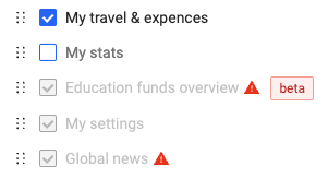
On this page, you will find all your task bar menu items (based on access) as shown on the left of your Moment page. By default, all boxes will be checked, and can be changed at any time.\
When a box is unchecked, it will be hidden from view on the task bar.\
The dotted symbol next to the check box makes it possible to rearrange the position on the item in your menu. Just drag-and-drop the dotted symbol and put the item where you find it more fitting.\
\
:grey\_exclamation:Remember to hit "Save" when all desired changes have been made for them to take effect.
## What the different things mean:
 \
\
**Blue check:** This item is activated and will show up in your task bar on the left side of your Moment page.\
**White box (unchecked):** This item will not be shown on your task bar, but you will still have access to these pages from other sources.\
**Gray check:** This item cannot be removed and is required to always have visible on your task bar. Can still be rearranged in preferred order.\
**Alert-symbol:** Indicates there's additional information to the point. Usually shown due to missing access, not included in your Moment plan, or the module is not activated for use.\ **\[BETA]****:** Indicates that this is a BETA-page and is under development and may be subject to change. BETA-pages are always used at your own risk.\
**Six-dotted symbol:** Indicates that the point can be dragged and dropped into position.\
\
\
\
**Save:** Required to click when all changes have been made for them to take effect.\
**Reset to default**: Reverts all changes back to standard Moment settings.\
:grey\_exclamation: These two buttons **only** affects the category group they belong to (ex. My pages).
\
\
**Blue check:** This item is activated and will show up in your task bar on the left side of your Moment page.\
**White box (unchecked):** This item will not be shown on your task bar, but you will still have access to these pages from other sources.\
**Gray check:** This item cannot be removed and is required to always have visible on your task bar. Can still be rearranged in preferred order.\
**Alert-symbol:** Indicates there's additional information to the point. Usually shown due to missing access, not included in your Moment plan, or the module is not activated for use.\ **\[BETA]****:** Indicates that this is a BETA-page and is under development and may be subject to change. BETA-pages are always used at your own risk.\
**Six-dotted symbol:** Indicates that the point can be dragged and dropped into position.\
\
\
\
**Save:** Required to click when all changes have been made for them to take effect.\
**Reset to default**: Reverts all changes back to standard Moment settings.\
:grey\_exclamation: These two buttons **only** affects the category group they belong to (ex. My pages).
 \
\
**Blue check:** This item is activated and will show up in your task bar on the left side of your Moment page.\
**White box (unchecked):** This item will not be shown on your task bar, but you will still have access to these pages from other sources.\
**Gray check:** This item cannot be removed and is required to always have visible on your task bar. Can still be rearranged in preferred order.\
**Alert-symbol:** Indicates there's additional information to the point. Usually shown due to missing access, not included in your Moment plan, or the module is not activated for use.\ **\[BETA]****:** Indicates that this is a BETA-page and is under development and may be subject to change. BETA-pages are always used at your own risk.\
**Six-dotted symbol:** Indicates that the point can be dragged and dropped into position.\
\
\
\
**Save:** Required to click when all changes have been made for them to take effect.\
**Reset to default**: Reverts all changes back to standard Moment settings.\
:grey\_exclamation: These two buttons **only** affects the category group they belong to (ex. My pages).
\
\
**Blue check:** This item is activated and will show up in your task bar on the left side of your Moment page.\
**White box (unchecked):** This item will not be shown on your task bar, but you will still have access to these pages from other sources.\
**Gray check:** This item cannot be removed and is required to always have visible on your task bar. Can still be rearranged in preferred order.\
**Alert-symbol:** Indicates there's additional information to the point. Usually shown due to missing access, not included in your Moment plan, or the module is not activated for use.\ **\[BETA]****:** Indicates that this is a BETA-page and is under development and may be subject to change. BETA-pages are always used at your own risk.\
**Six-dotted symbol:** Indicates that the point can be dragged and dropped into position.\
\
\
\
**Save:** Required to click when all changes have been made for them to take effect.\
**Reset to default**: Reverts all changes back to standard Moment settings.\
:grey\_exclamation: These two buttons **only** affects the category group they belong to (ex. My pages).